Coalesce Typeface
Poster Series
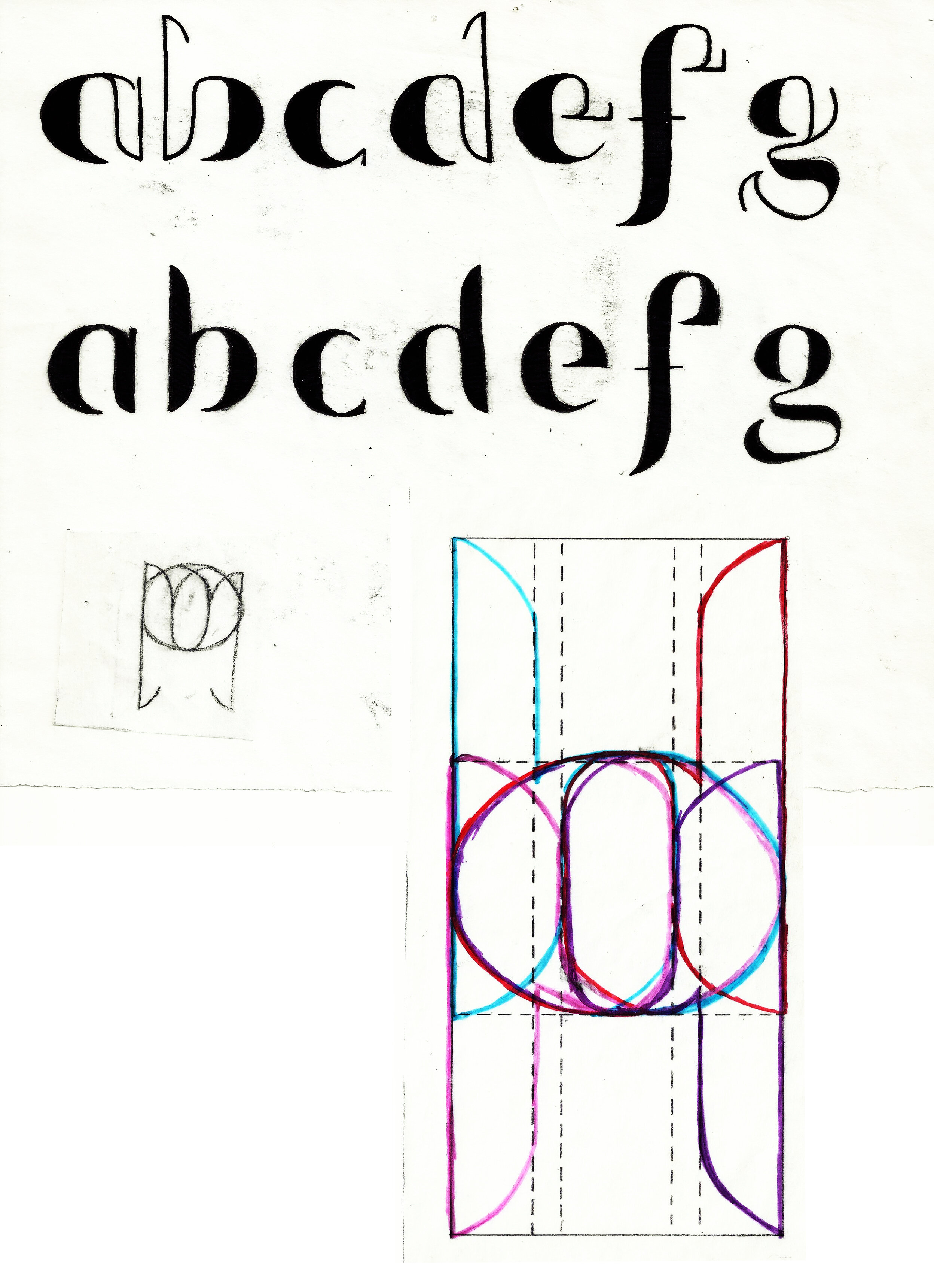
Using Jersey City as inspiration, the city I grew up in, I designed a typeface that demonstrates how contrasting forces have the ability to come together in unity. Jersey City is a place filled with unique personalities which emanates vivacity. This is a result of the combination of opposites scattered throughout the city. Old and new. Hand-crafted and mechanical. Patches of brick roads peek out from under the pavement while bright murals paint the walls of renovated warehouses. The older, gritty parts of the city are mixed with the newer, developing structures and businesses. Coalesce means to come together and form one whole and that is just what this typeface illustrates about Jersey City’s mix of personalities.
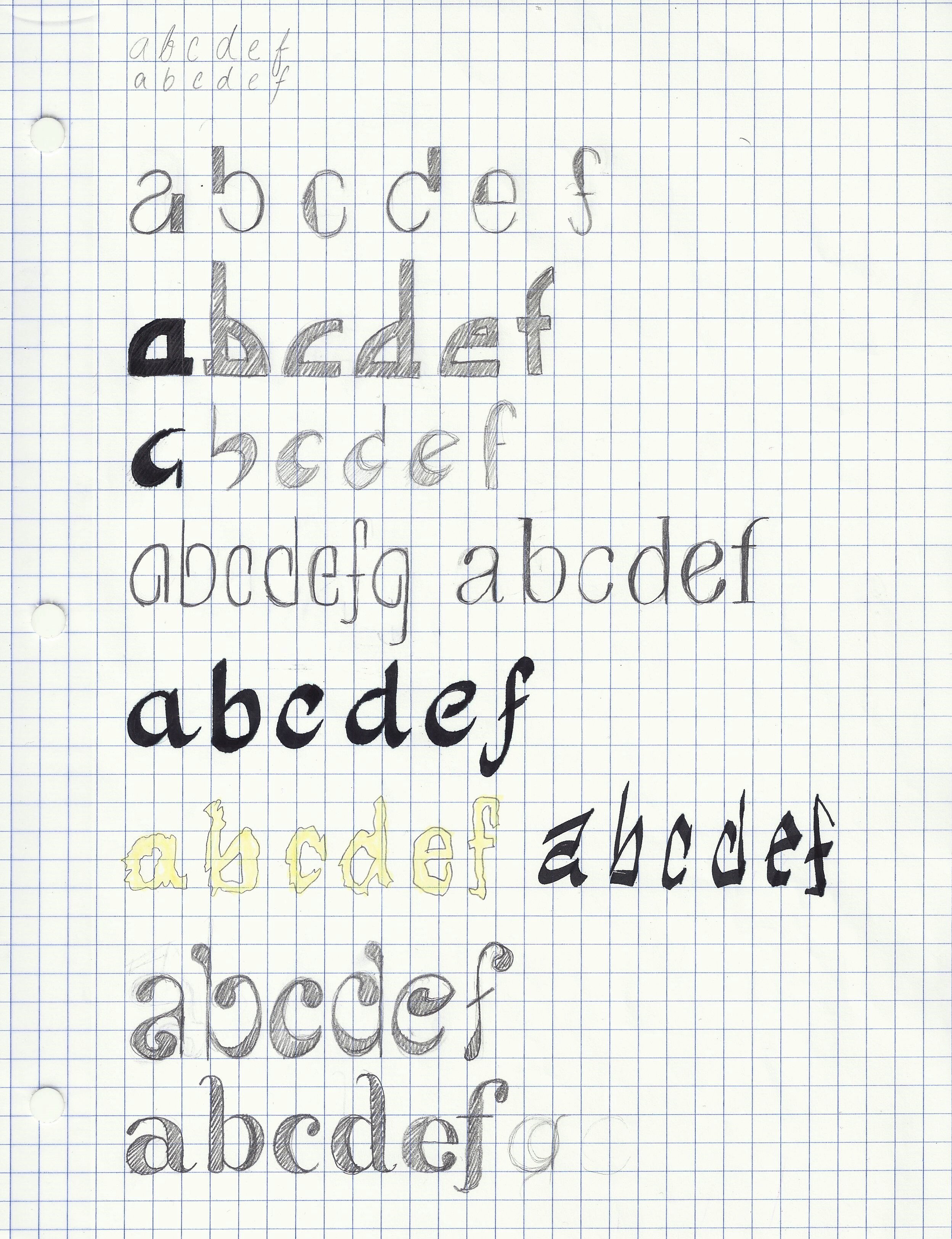
Coalesce features an x-height that is slightly more than the length of the cap height. Its ascenders and descenders are equal in length, creating a fairly balanced design. Another important feature to note is that the filled in version was modified to be slightly thinner so as to not appear too bulky when compared to its half-wireframe version.
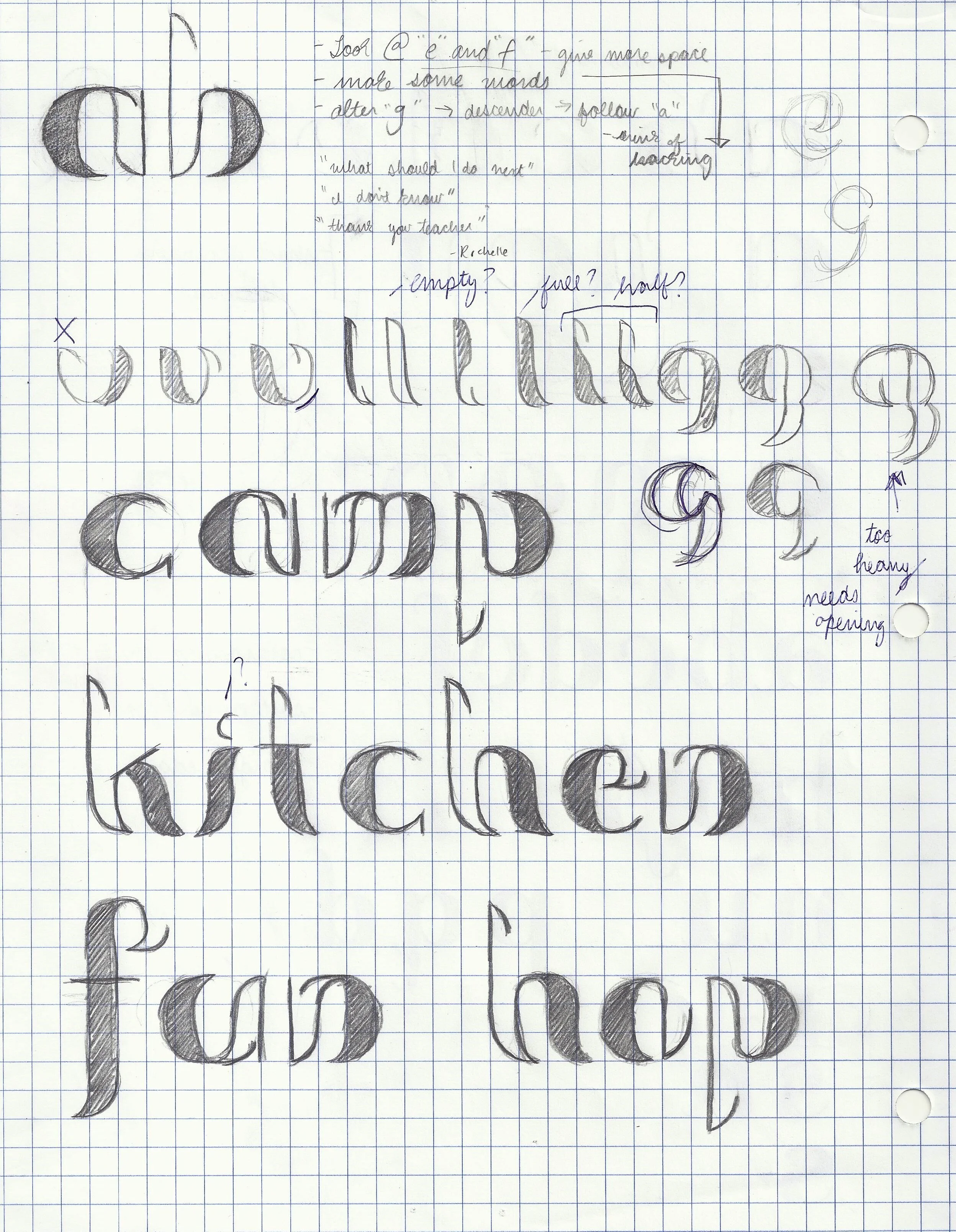
After designing this typeface, I then implemented my work into a poster design series of 3, explaining my process and inspiration.